- Jobs
- Open Calls
- Events
- Learning
- More
- SUBMIT
MANIPULATING VODKA AND TEA TO PLAY WITH THE ALCHEMY OF PAINTING IN HIS UNIQUE WORKS, SAY HI TO CARNE GRIFFITHS
CARNE GRIFFITHS
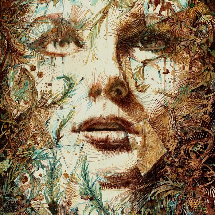
Just out of reach - ink and tea on bockingford watercolour paper, 2016
You work in quite a unique medium combining traditional materials with vodka and brandy! How did this come about? What do you hope it bring to the works?
I like to experiment in the studio, bringing together materials which to me have unknown results adds a little alchemy to the work - hot tea is repelled by alcohol on the page and separates the ink in different ways, so using materials in unknown combinations keeps things fresh and interesting for me. A lot of the work is about interpreting chance and as such I like to allow as many accidents to occur within the work as possible.
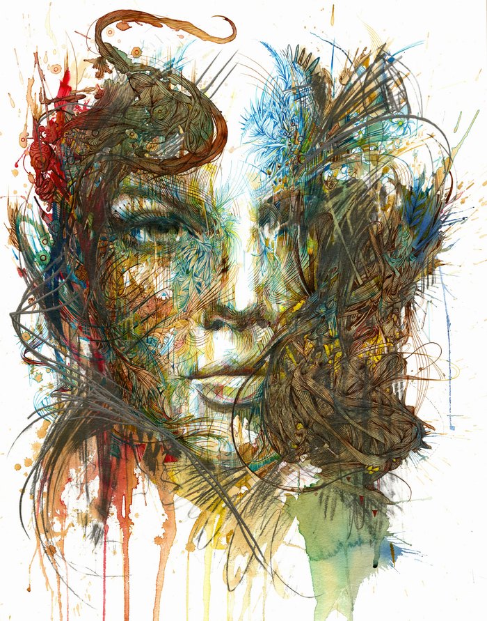
The Tempest - Ink and tea on bockingford watercolour paper, 2015
A lot of your works feature a defined colour palette, is this something you’ve worked on over time or just a natural vibe? It really helps with creating the dream like quality to your work - why do you think creating this feeling in the work is so central to your practise?
I had always struggled with colour before introducing the earthiness of tea into the equation. I work with a very limited palette of colours, predominently turquoisse ink sepia ink and a variety of different teas. In some ways these are my three primaries for painting but they allow me to be less concerned with colour as part of the process, so instead of intentionally placing colour during painting, I allow myself to be more free and let the fall of materials dictate where colours are.. sometimes this works and sometimes it doesn't and that's where the layering of marks comes into play, either accentuating the colours that have appeared or using those marks to change the tone or hue of a certain area.

Release - Ink, tea and Acrylic on bockingford watercolour paper, 2016
Your work takes inspiration from things you see in your daily life - what’s your most inspirational spot, a park bench, a coffee shop?
In a lot of my work the imagery comes from memory and from things which I store in one way or other whilst looking around, for me natural forms and shapes in nature are the most striking and the ones that figure most heavily in my work. I try not to draw these elements from reference but from studying and remembering an object, and in this way you can explore and learn to draw the object from different angles. I am not really concerned with the authenticity of the plants I draw as I think there is so much variety in nature that the fantastical elements in the work no matter how far fetched seem to have there counterparts in the real world.

Reverie - Ink and tea on Bockingford watercolour paper, 2017
Who would you say has been the biggest influence to your work, either personally or someone you admire - and if you could give them one work of yours which one would you choose?
One artist I constantly return to is Leonardo Da Vinci, not simply because of his artistry and craftsmanship but in the way he challenged and constantly evaluated the world around him. I believe we shouldn't settle for the answers that we are given and should always question for ourselves, for me being an artist allows us to do this much more freely because there are less restrictions, less right and wrongs. Within Da Vinci's notebooks are an insight into a brilliant mind which questioned everything around him, and I adore his explorations into finding out exactly how things worked and how he could solve problems using examples from nature as inspiration, so I suppose I would choose a piece which personifies our understanding and relationship with nature, maybe the piece ‘Unity’.

Listening - Ink and tea on bockingford watercolour paper, 2017
You were a master gold wire embroidery designer in a past life, do any of the skills you picked up then have an impact on the way you approach your works now?
yes very much so, when I worked as an embroidery designer I drew almost all day every day for 12 years, and I predominently drew floral pattern to fit inside specific shapes and areas. This repetition really informed my drawing style and it comes into play wheb I interpret the random marks and spills on the page. It made me accutely aware of positive and negative space within a painting too, and most of my work emplys the use of the unpainted background paper as 'light' within the painting, I rarely use any white pen paint or pigment, for me the untouched parts of he paining are of equal if not more importance than the painted parts and I think this approach is very much derived from an understanding of floral pattern particularly in the case of William Morris whose designs have a perfect balance of flow and positive negative space.
You’ve had your works used in films and in fashion collections - if you could have your work featured in any film or collection which ones would you pick and why?
I was fortunate to cross paths with Alexander McQueen on two occasions whilst working as an embroidery designer and I would have loved to have had the chance to work alongside him or to see him at work on a collection, for me he was a true creative, driven, openly acknowledging his outside influences but with such a powerful energy and vision of what he wanted to achieve. I saw him as a fearless designer and that is something I really respected in his work.
VISIT WWW.CARNEGRIFFITHS.COM TO CHECK OUT MORE OF CARNES’ UNIQUE WORKS
INTERVIEW by HANNAH SMITH
 Ana Kim
Full time Artist |
 MARK DUNHILL
Dean of Central Saint Martins |
 Nicole Helena
Photographer |
 Xiuching Tsay
Fashion Illustration |


